Image Image
Pinned

Welcome To 37 Raccoons!

Hey friends, welcome to 37 Raccoons!

You may be wondering, first of all, why 37 Raccoons?

Well, to keep the backstory short, when I first started creative journaling, I had NO idea what to journal about. I decided to create a spread about one of my favorite animals by using stickers and papers I had on hand. By the end of the spread, my page contained 37 Raccoons. That first spread got me hooked on creative journaling, and using digital products in different ways to make something that brings a smile to my face!

Over the years, I've done a few creative projects to bring in some money as we move from place to place (my husband is still Active Duty military). I've created hyperlinked digital planners, printable planners, and all other kinds of digital downloads that I still use in my daily life. I've sold these in Etsy shops and on my own websites, and now I want to share these products with you here, in a community where we can collaborate, so you can create things that bring a smile to your face without breaking the bank!

Products I love to create include mixed patterns, plaid patterns, junk journal ephemera, AI images, hand drawn clip art patterns, journal cards, planner dashboards, folios, and all kinds of other things. While these have labels as to what they are, once you print and cut them out they can be anything you choose!

I'm excited to share with you, show you how I like to journal, and learn from you and your particular styles!

Please take some time to comment below and introduce yourself, and I can't wait to see what we create together!
Image Image
Pinned

Use of AI (Artificial Intelligence

A bit of transparency here, because nobody likes to buy something and then find out it's something else. Bottom line up front- I do use Artificial Intelligence to create some of my work, and specifically I use a Midjourney subscription- combined with Photoshop and Procreate along with Topaz AI Upscaler - to create themed image packs to use in some of my final products.

Not all of my artwork is AI Generated. You will find Clip Art Patterns that use hand drawn clip art packs to create, and some junk journal elements like papers and journal cards as well. 

In addition, seamless patterns are entirely made by me in Photoshop, and all products featuring these patterns are made in Photoshop by combining my layer files with different non-AI generated shapes and layers.

Why do I choose to use AI? Simply put, it allows me to offer to you, and use for myself, a LOT of different options for fun crafty projects at a low price.

While I do use AI, I use personally crafted prompts to generate the images I am looking for, and do not insert other artists' work as an image reference when generating a certain style. I may use images I have created myself to "train" the AI to get the desired end result, but not images from the web, Etsy, Pinterest, or elsewhere.

If you are a member, I will offer you some of the "raw images" that I create so you can use these in fun ways however you wish, and also create other items that match the sets you download from the shop and your subscriptions. Please note that these images may have flaws, and may not be at 300 dpi for larger printing or acceptable use in products for sale. Additionally, these files will have a background even as PNG files- they are not transparent!

If you have any questions, feel free to drop them in the comments!

Image Image

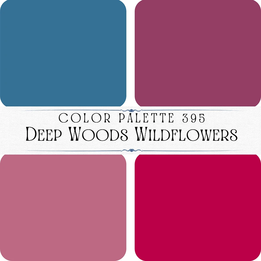
Color Palette 395- Deep Woods Wildflowers

This color palette, titled “Deep Woods Wildflowers,” combines rich, earthy tones with vibrant hues, capturing the beauty of wildflowers thriving in the forest. Here’s the breakdown:

1. Top Left: A deep, muted teal blue, reminiscent of clear forest skies or deep woodland streams. #357196

2. Top Right: A warm berry plum, symbolizing the richness of wildflower blooms. #933e65

3. Bottom Left: A soft, dusty mauve, adding a gentle and understated floral touch. #bd6983

4. Bottom Right: A bright, vibrant magenta, representing the bold and striking beauty of wild blossoms. #bb0049

This palette is balanced yet lively, making it perfect for designs inspired by nature’s elegance and the contrast between earthy and vibrant elements.

Image Image

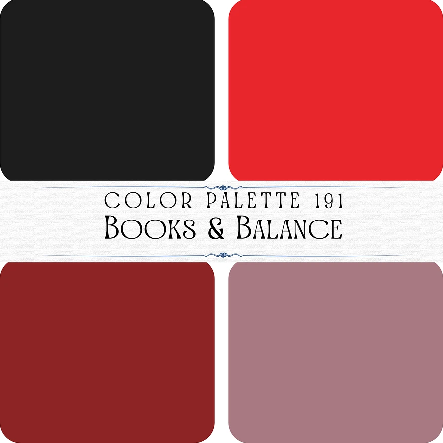
Color Palette 191- Books & Balance

This color palette, titled “Books & Balance,” is bold and dramatic, with a sophisticated and grounded feel inspired by the timeless appeal of literature and introspection. Here’s the breakdown:

1. Top Left: A deep, classic black, symbolizing elegance, depth, and balance. #1d1d1d

2. Top Right: A vivid crimson red, adding energy, passion, and intensity to the palette. #e9262c

3. Bottom Left: A rich, dark maroon, representing warmth and a sense of tradition. #8c2425

4. Bottom Right: A muted mauve, offering a subtle and refined complement to the bold tones. #a87981

This palette combines strong, striking colors with a softer neutral, making it ideal for designs that convey power, sophistication, and balance, such as book-themed or academic aesthetics.

Image Image

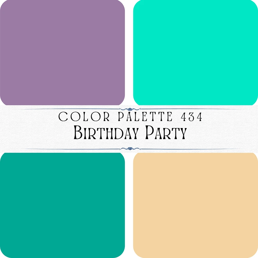
Color Palette 434- Birthday Party

This color palette, titled “Birthday Party,” is lively and celebratory, with bright and cheerful hues perfect for a festive occasion. Here’s the breakdown:

1. Top Left: A soft lavender purple, adding a playful and whimsical touch. #9b7ba4

2. Top Right: A vibrant aqua teal, symbolizing energy and excitement. #01e8c4

3. Bottom Left: A rich turquoise, evoking a sense of fun and tropical vibes. #00a793

4. Bottom Right: A warm, creamy beige, providing balance and grounding to the bright colors. #f4d4a1

This palette combines energetic tones with softer, grounding hues, creating a fun and harmonious mix ideal for party decorations, playful designs, or cheerful branding.

Image Image

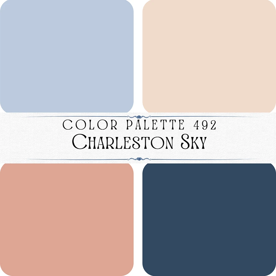
Color Palette 492- Charleston Sky

This color palette, titled “Charleston Sky,” is a soft and elegant collection of hues that evokes the charm of a serene southern sky and historic architecture. Here’s the breakdown:

1. Top Left: A muted powder blue, reminiscent of a calm and clear sky. #bccbde

2. Top Right: A delicate peachy beige, symbolizing warmth and subtle sophistication. #f1dbcd

3. Bottom Left: A dusty terracotta, offering an earthy and inviting tone, reminiscent of old brick or clay. #dea594

4. Bottom Right: A deep navy blue, grounding the palette with richness and stability. #324860

This palette combines soft pastels with a strong accent, creating a timeless and refined aesthetic perfect for vintage-inspired, coastal, or architectural designs.

Image Image

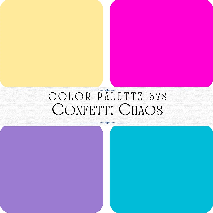
Color Palette 378- Confetti Chaos

This color palette, titled “Confetti Chaos,” is a vibrant and playful mix of bold and cheerful tones, evoking the energy and fun of a festive celebration. Here’s the breakdown:

1. Top Left: A soft pastel yellow, symbolizing sunshine, warmth, and joy. #ffea9b

2. Top Right: A bright neon pink, adding a bold and energetic pop of color. #fe00d2

3. Bottom Left: A rich lavender purple, offering a calming yet fun complement to the brighter tones. #9b7ad1

4. Bottom Right: A vivid turquoise blue, representing excitement and vibrancy. #00bcd7

This palette is dynamic and full of life, making it perfect for party, festival, or playful design themes that aim to capture the spirit of celebration.

Image Image

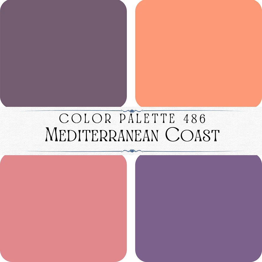
Color Palette 486- Mediterranean Coast

This color palette, titled “Mediterranean Coast,” captures the vibrant and romantic hues of a sunset over the sea, paired with the earthy tones of coastal landscapes. Here’s the breakdown:

1. Top Left: A deep, muted violet, evoking twilight skies and a sense of elegance. #745b71

2. Top Right: A warm coral orange, representing the vivid warmth of the setting sun. #ff9976

3. Bottom Left: A dusty rose pink, symbolizing warmth and romance, reminiscent of Mediterranean architecture or flowers. #e1888e

4. Bottom Right: A rich lavender purple, adding depth and a touch of tranquility. #7d628d

This palette blends warm, sunlit tones with cool, calming purples, creating a harmonious and picturesque feel inspired by coastal sunsets.

Image Image

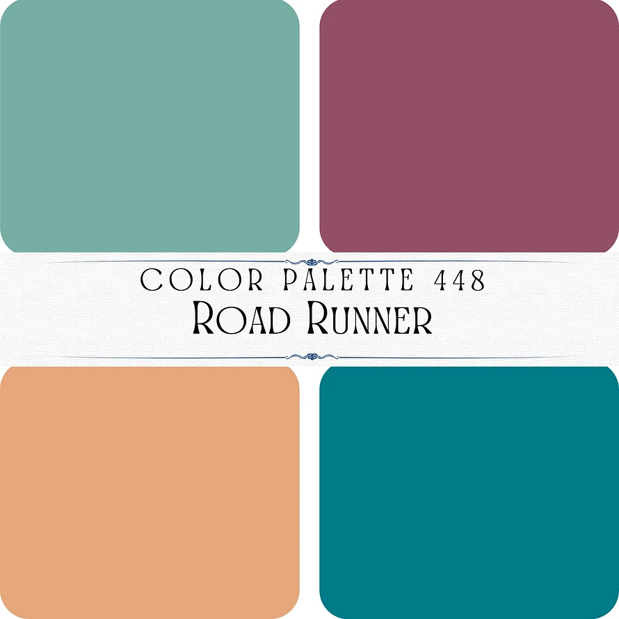
Color Palette 448- Road Runner

This color palette, titled “Road Runner,” combines earthy and jewel-like tones, evoking a sense of adventure and the open road. Here’s the breakdown:

1. Top Left: A muted sage green, symbolizing natural landscapes and serenity. #76aea5

2. Top Right: A deep plum purple, adding richness and sophistication to the palette. #934f68

3. Bottom Left: A warm peachy tan, reminiscent of desert sands or earthy trails. #e6a67a

4. Bottom Right: A rich teal blue, representing depth and the vibrancy of a clear sky or distant waters. #007a87

This palette blends warm and cool tones to create a balanced yet dynamic aesthetic, perfect for designs inspired by exploration, nature, and vibrant travels.

Image Image

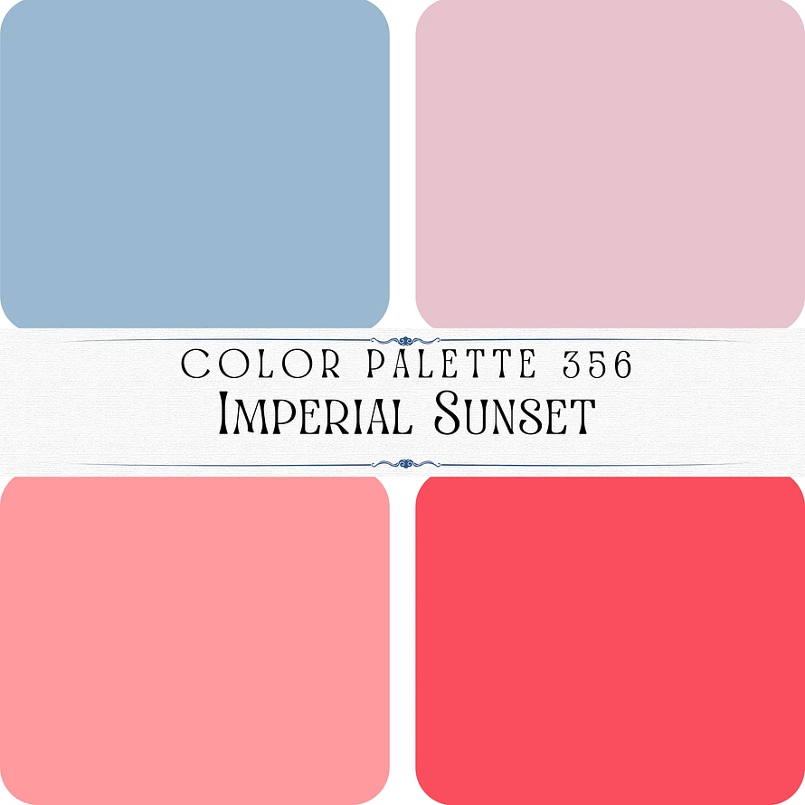
Color Palette 356- Imperial Sunset

This color palette, titled “Imperial Sunset,” features soft and warm tones inspired by the delicate hues of a sunset. Here’s the breakdown:

1. Top Left: A muted sky blue, representing calm and the fading light of the sky. #99b9d0

2. Top Right: A pale blush pink, adding a soft and romantic element. #e7c3cd

3. Bottom Left: A warm coral pink, reminiscent of the vibrant yet gentle glow of sunset clouds. #ff9a9e

4. Bottom Right: A bright watermelon red, evoking the intense and fiery hues of the setting sun. #fa4e5e

This palette is warm, uplifting, and harmonious, perfect for designs inspired by serene and colorful transitions, like sunsets or evening skies.