Color Palette 030- Pottery Class
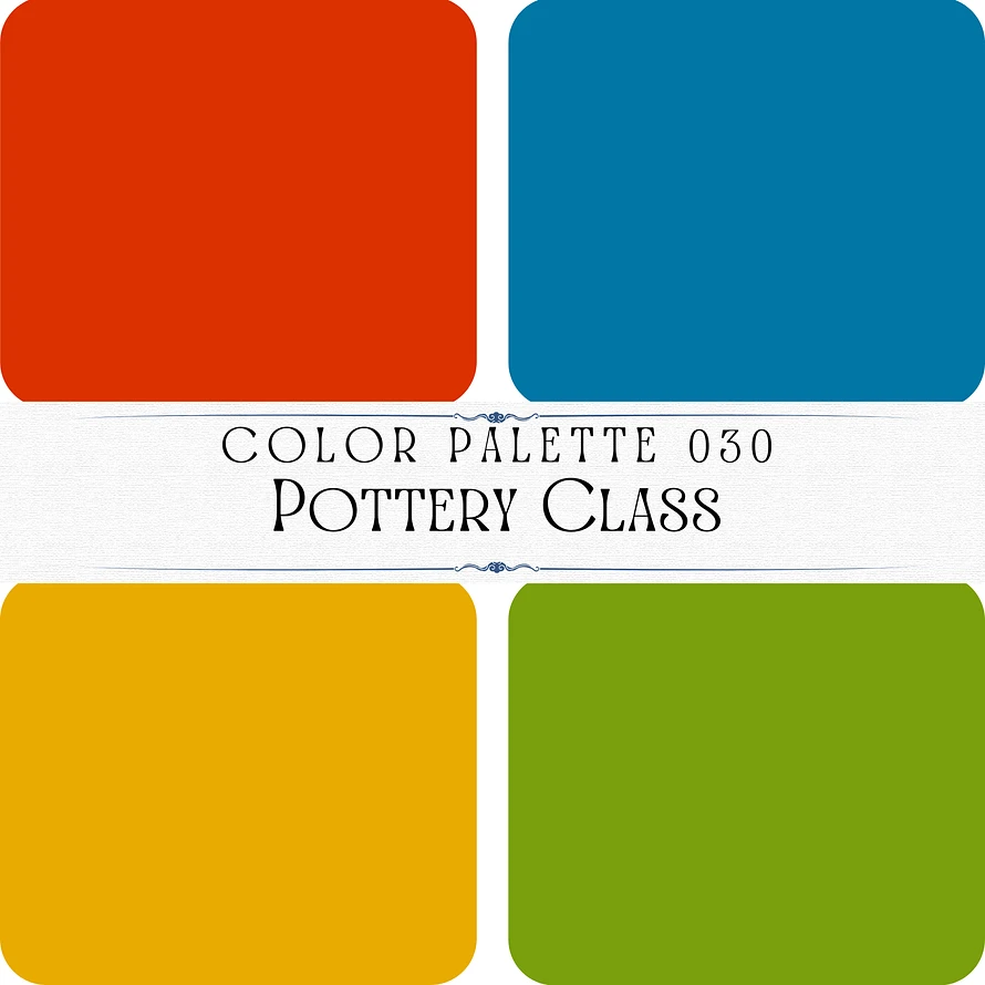
This color palette, titled “Pottery Class,” features vibrant and bold tones that exude creativity and energy. Here’s a breakdown:
1. Top Left: A vivid, warm red-orange tone, symbolizing energy, warmth, and creativity. #db3100
2. Top Right: A bright and bold teal blue, evoking a sense of vibrancy and freshness. #0177a5
3. Bottom Left: A rich golden yellow, representing warmth, joy, and enthusiasm. #e8ac00
4. Bottom Right: A lively lime green, adding a fresh, earthy, and natural balance to the palette. #7aa00d
This palette combines primary and secondary colors to create a dynamic and playful combination, perfect for artistic or creative designs.

