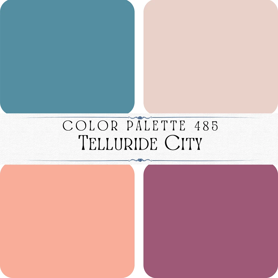
Color Palette 485- Telluride City
This color palette, titled “Telluride City,” combines soft, earthy tones with a hint of vibrancy, evoking a rustic yet refined charm. Here’s the breakdown:
1. Top Left: A dusty teal blue, representing calmness and a connection to nature. #548ea2
2. Top Right: A soft beige-pink, offering a neutral and delicate balance to the palette. #ead1ca
3. Bottom Left: A warm, peachy coral, adding a cheerful and lively element. #faad99
4. Bottom Right: A deep mauve or plum, bringing depth and sophistication to the mix. #9e5978
This palette is versatile and elegant, perfect for designs inspired by mountain towns, natural beauty, or a cozy, modern aesthetic.

